


I've been working on my front cover for my music magazine, I've taken lots of pictures so I have a lot to choose from. I want something quite alternative and eye-catching. The model I have chosen has bright red hair, so this could add to the alternative theme - which suits my magazine genre.
I don't want my front cover to be to busy, I want to provide the basic information, but want the reader to buy the magazine and read more.
My inspiration for my magazine is magazines like Billboard, Spin and Rolling Stone. All three very successful magazine known for the professional print, good quality editing and a simple, alternative design.
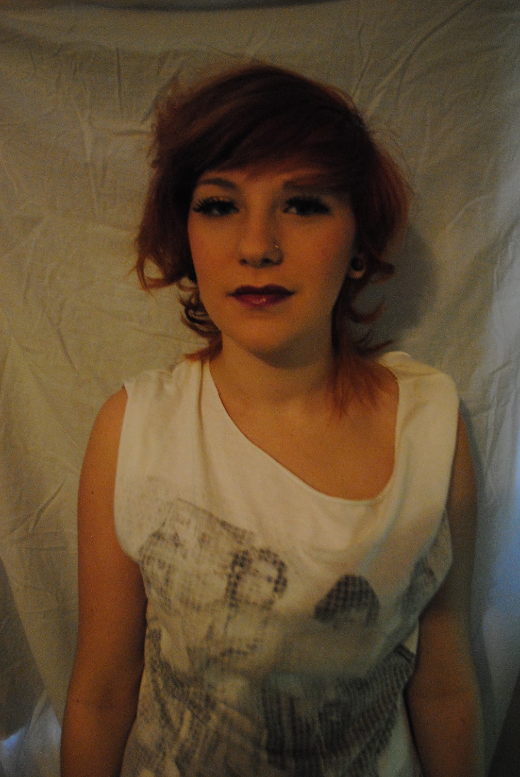
This is the picture I'm going to use for my front cover, I have done some editing to it, i've made the picture more brighter, and boosted the contrast to make it stand out more.
The background is not plain, so I slightly blurred the corners of the image, to make the model be the main attention of the image. She is wearing quite alternative clothes, which again suits the genre of the magazine.

Possible Fonts For The Magazine Title

ICON
Looking at the two magazine title fonts, I think the second one looks the best. It looks alternative and this will suit the genre of the magazine. The first font wouldn't portray what the whole magazines about.
No comments:
Post a Comment