Thursday, 16 February 2012

Making The Front Cover

I don't want the magazine to be to busy, but then again want to attract readers to buy it.
The main image itself is quite big and bold, which instantly will make the magazine stand out on the shelf.  The actual content i'm going to use will be pretty basic. I only want the basic information, that will entice the reader to buy it. 
I have been working on Indesign, to create my magazine. 
I've decided to call my magazine ICON - My genre for the magazine is quite alternative music, or example including people like florence + the machine and oasis. But will be lightly touching on other genres of music such as pop and rock. I choose ICON because its a simple word, something people will remember + the people I want to be featuring in my magazines will be Icons in the music industry.
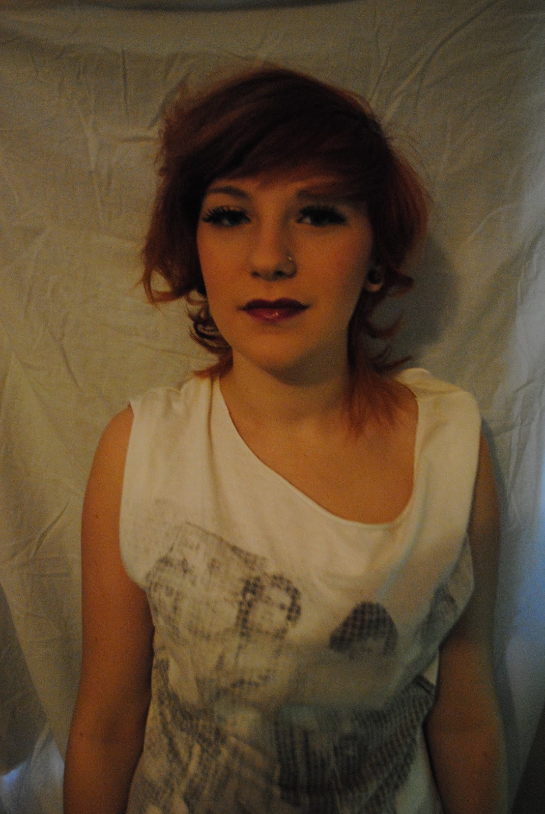
My model is pretending to be a girl from a band, and her names LIV FIERCE, i'm pretending that she is a very famous person, and in the magazine there will be an article bout her, i've quoted from the article included inside because it may make the reader want to know more about her and why she 'would be nowhere without her band'.
On the left side, I have included some big named bands that will be featuring in the magazine.
The color scheme basis on, reds, blacks and whites. These relate to the image, the use of red fonts make the models hair stand out much more, which is almost the main attraction to the front cover.

Choosing My Main Image


I've been working on my front cover for my music magazine, I've taken lots of pictures so I have a lot to choose from. I want something quite alternative and eye-catching. The model I have chosen has bright red hair, so this could add to the alternative theme - which suits my magazine genre.
I don't want my front cover to be to busy, I want to provide the basic information, but want the reader to buy the magazine and read more.
My inspiration for my magazine is magazines like Billboard, Spin and Rolling Stone. All three very successful magazine known for the professional print, good quality editing and a simple, alternative design.

This is the picture I'm going to use for my front cover, I have done some editing to it, i've made the picture more brighter, and boosted the contrast to make it stand out more.
The background is not plain, so I slightly blurred the corners of the image, to make the model be the main attention of the image. She is wearing quite alternative clothes, which again suits the genre of the magazine.


Possible Fonts For The Magazine Title 


   ICON
Looking at the two magazine title fonts, I think the second one looks the best. It looks alternative and this will suit the genre of the magazine. The first font wouldn't portray what the whole magazines about.